Here're the roughs for the first 3 pages!!
Saturday, 28 May 2011
Dark Harvest - Intro comic!!!
As well as being commissioned to do the four illustrations as shown in the previous post, I was offered the opportunity to illustrate a 6 page comic that acts as a kinda introduction into the world of Promethea!!


Dark Harvest: The Legacy of Frankenstein
So a couple weeks ago I was commissioned by the lovely Iain Lowson to do four Illustrations for his RPG called Dark Harvest: The Legacy of Frankenstein!!
To wet your appetites here are the roughs for said illustrations!


You can find all you'd want to know about the RPG right here: www.darkharvest-legacyoffrankenstein.com
Friday, 27 May 2011
Promises - Page three Pencils


I should warn you folks now that this shall be the last WHOLE Bayou Arcana page that I post up!!
Once I've got this page all coloured up you shall only see glimpses of odd panels and things from the remainder 3 pages, gotta keep the mystery now! :P
I hope to also be posting up development stuff for the other projects that I'm currently involved in, so you shan't have a shortage of pretty things to look at! :D
Sunday, 22 May 2011
Finally up for your viewing pleasure, my Octopus Esting!!!
HERE IT IS!!! My E4 Esting via youtube!!
With absolutely no word what so ever from E4 about wether or not my entry will ever be put up on the website, or in fact has actually be received, I have decided enough is enough!!
It has been FOREVER since I completed and entered it , and sent numerous follow up emails regarding wether or not it will appear on the website or has been accepted into the competition at all!!
I CAN'T wait any longer to share it with you all!
So here he is, the one, the only showering Octopus!!
Wednesday, 18 May 2011
Promises - Page two Colour!!

First I select a couple of textures, these are jpegs I've made, scanned, found, even google searched! For this scene the primary colours would be the rich chocolaty brown and wood panels of the dining room inside The Charon.


I then pick a flat background colour for it all to sit on, this acts as the colour for the gutters and bleed. This dark brown was used as the background colour for page 1 so I just re-used it for this page too (continuity!!!)
The textures are then brought in and layered behind the pencil sketches, which are set to the Multiply blending mode. The levels of the sketches are altered slightly to make them darker and more visible, and the textures have a blending mode put on them to combine them.
Here the brown paper has the wood texture layered over using the Soft Light blending mode, this makes the wood grain appear more subtle. The wood is also erased at 60% or so opacity around the figures to give them a lighter base to "paint" onto.

(Erm.. I must have got a bit mixed up with my layers on the bottom block of panels and painted onto the texture layer... whoops!)
Next I build up the colour. It's difficult to show you the exact process in which I do this as I try to use as little layers as possible to save disk space/loading and saving times... (My laptop is quite old now and will probably burn out opening a massive file!!)
But I'll try my best to talk you through the method... I use a Chalk Blender brush set to 25% opacity, 50% flow to block in the colour on a layer underneath the pencils, and practically paint in shadows/form as anyone would paint on paper! I vary the opacity of the brush constantly to make some areas lighter some darker, but ultimately by not using a 100% opacity I'm allowing colour from the base textures to show through and so make the colours I add into the picture look like they belong!
For example the Actress Margaret Belmont, her red dress in this setting would look a browny/yellowy red in the candle lit wood paneled room. If I were to use that red in 100% opacity I'd need to do some serious blending work to make it look like she isn't just plonked into the scene. By gradually building up layers of colour in a 25%/30% opacity the brown texture shows through and the hard work is done for me. It's very similar to watercolour painting in a way... only if I screw up I can press undo!


Next I used a Chalk Pastel brush on a separate layer, on top of the pencils, to scatter in some highlights that can sit on top of the darker pencil line. The brush'll be set at a higher Opacity something like 70/80%. The non-uniform stroke of the brush makes the highlights look more dappled and natural and not too shiny!!
Unless of course I want bits to look shiny, in which case I'll use good 'ol Chalk Blender at 90% or so.
Sometimes also the pencil line can be too dark for the highlighted area, if this is the case I'll simply erase it out and use the painted highlight to define the edge.

Then over the top everything done so far yet another texture is layered on. This one is a Greyscale natural paper texture, set to the Colour Burn blending mode and a 20/30% opacity. This subtle layer just ensures that any of the colour blending that I did in the characters etc, doesn't look too polished and flat compared to the background. It makes it feel like the colours have been painted onto a heavy weight paper, and just grounds them within the image a little more.
Next I choose a texture for the frames, In this case I went for a kinda distressed orangey/gold number so it stands out more amongst the rich browns (and kinda looks like a gilded victorian portrait frame!). Then I have to erase the texture out around the frame outline, which is fiddly considering I decided to make things hard for myself in adding lots of twiddly bits!!

And then the same as with the characters, I add some highlights and make it all look shiny. And the final cropped page is as you saw it at the top of the post!!
(Also a note on the frames... more will be added to this page but at a later date, as they will contain text!!)
Tuesday, 10 May 2011
Page two, panel re-design!!
Here are the pencils for a re-design of the 1st panel of page two.
Previously it was a bird's eye shot of the table, but dropping the angle to Waldrip's POV down the table works much better on the page!

Saturday, 7 May 2011
Promises - Page two Pencils
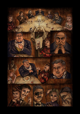
Page two of Promises is all drawn up!!
Featuring framed...


... and un-framed versions. Though I think I might just stick with the frames as they proved to look quite effective in page one!!


I'm a sucker for little details. Note in panel 1 how Alice is melancholically pushing her food around the plate. Waldrip is surrounded by extra little plates of food and greedily feeding that massive appetite of his. And the Priest Morgan McKenzie, who has not touched his cutlery is drinking deeply from his wine glass (he's the one with the opium/drink addiction..)


Chugging down the Arcana

This is the first panel from page 1 of 'Promises'.
I thought it might be quite nice to show the whole picture in colour, everything that lies behind the overlapping inset panels...
It makes for quite a nice stand alone illustration, I reckon.
Friday, 6 May 2011
Promises - Page one Colour!!
So here it is, the first page of Promises in full colour!
Featuring first, the variation with the framed inset panels. Which now that is it coloured up seems to work quite well I think!


And the way the page would look without the frames....

Now on to page two!! :D
Subscribe to:
Comments (Atom)